

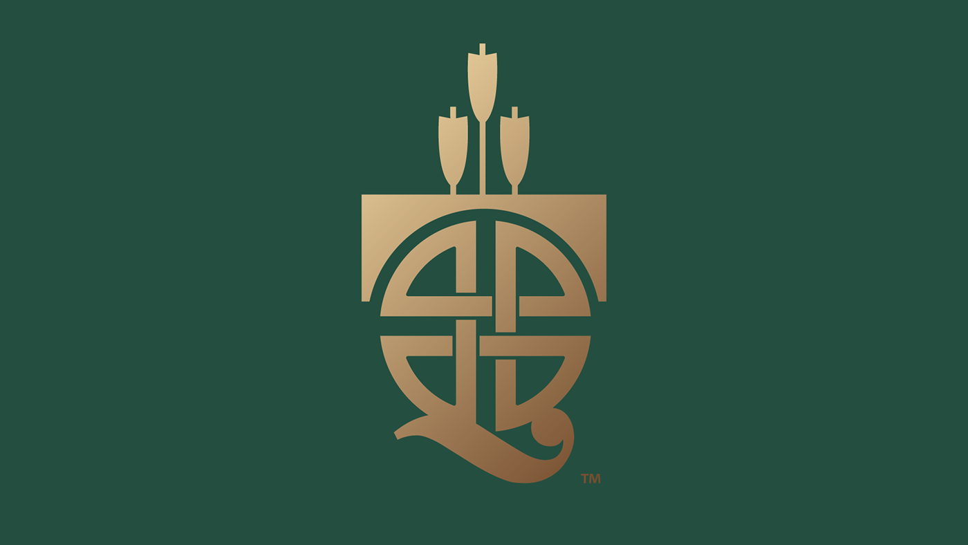


The Tartan Quiver brand identity is a masterful blend of Scottish tradition and modern sophistication, exemplified by its logo and name. The name itself is a thoughtful fusion of ‘Tartan,’ symbolizing Scottish heritage known for its distinctive plaids associated with different clans, and ‘Quiver,’ representing a selection or ‘quiver’ of choices, hinting at a variety of whisky flavors and experiences offered by the brand.
The logo elegantly integrates these concepts; the iconic Scottish tartan pattern is abstracted into a series of interlocking shapes that form the backdrop for a stylized quiver holding arrows. This represents precision and care in the curation of the whiskies, much like arrows carefully selected by an archer. The arrows can also be seen as a metaphor for the distillery’s aim to target and satisfy the diverse palates of whisky aficionados.
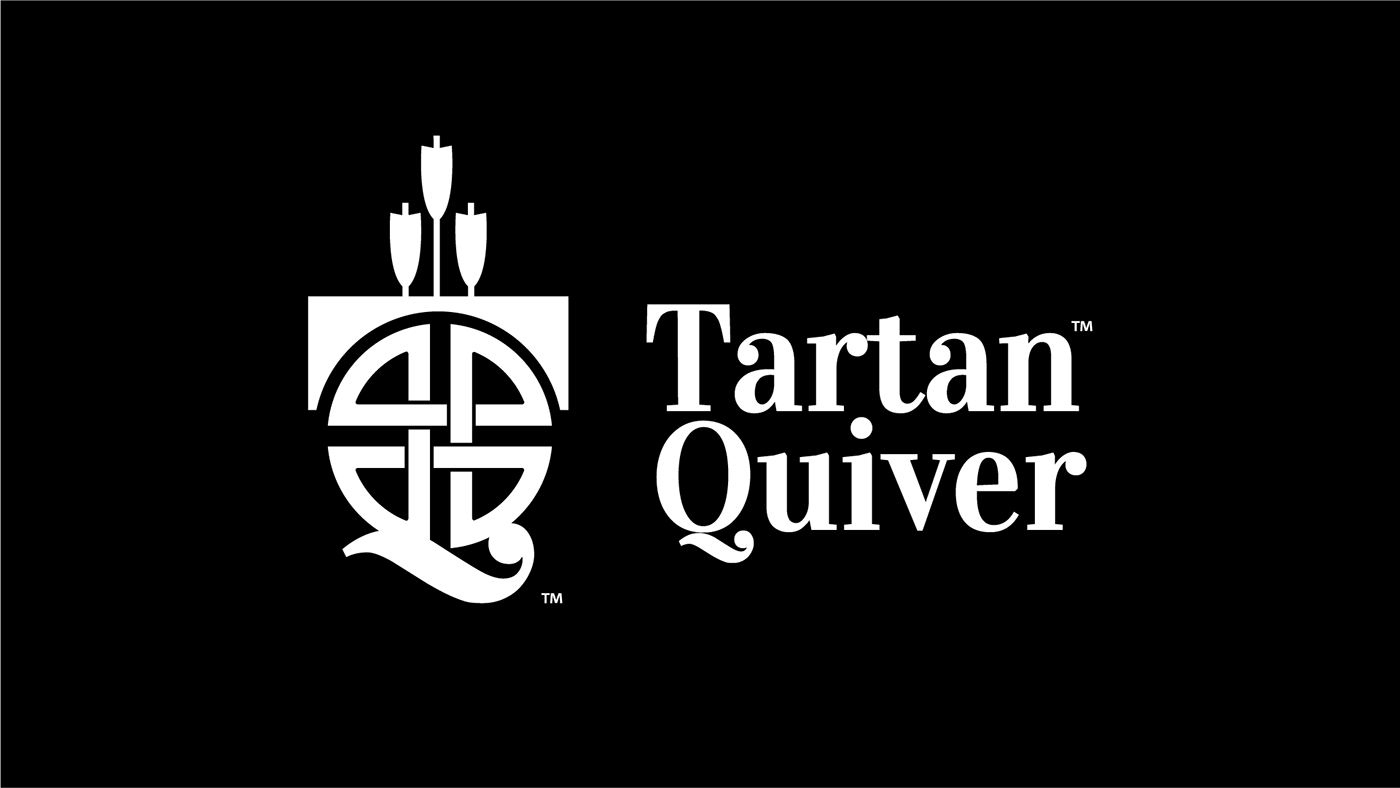
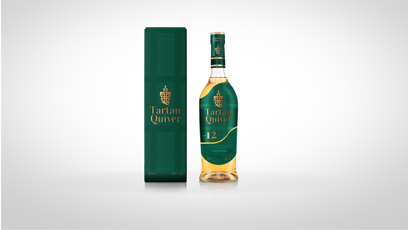
Rendered in a noble gold against a deep green background, the logo exudes luxury and quality. The font choice for ‘Tartan Quiver’ mirrors this elegance, with serifs that offer a nod to the past, yet with a modern twist that keeps the brand current and accessible.
This brand identity is not just a label but a narrative – one that tells of heritage, selection, and a journey through the sensory landscapes of Scotland’s finest. Every touchpoint with the consumer, from the logo to the packaging, from the marketing campaign to the digital presence, is an invitation to explore and savor the richness of Tartan Quiver Scottish whiskies.


